|
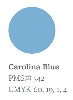
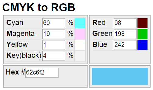
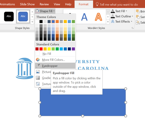
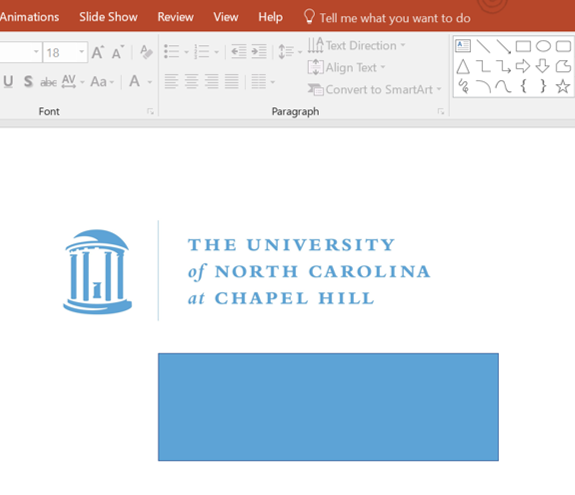
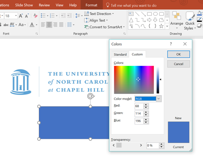
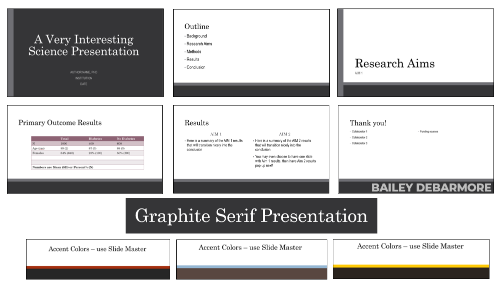
Search Google for "best powerpoint templates" and you'll get a number of modern designs for sales pitch decks, portfolios, business plans, and CV/resume presentations (like these). Not sure what a CV/resume presentation is? If you're asked to give a presentation as part of a job interview, you might start with some introduction slides. CV/resume presentations put your CV/resume into a presentation format. Infographics have become popular in almost every field, but in more traditional areas, like science and academia, I believe there's a bit of a line to draw. You may notice I have an infographic on my About page as well as on my LinkedIn. Personal websites and the media feature of LinkedIn are great spots for some well designed graphics. Just make sure they are informative, and look good when display-cropped on LinkedIn. So if you can't use one of those fancy infographic templates for your next lab presentation or even your dissertation, what are you to do? Many academic institutions have ready-to-download institutional templates. By the end of this post, you'll know how to modify any PowerPoint template to suit your purposes. When looking for logos or identity colors, institution templates can be a helpful place to start. I'm going to briefly explain 1) how to utilize Slide Master to design your own templates 2) how to match colors to your institution identity. I've also provided a free PowerPoint template, ready for you to use! Just leave a comment if you download, and let me know how you think you'll use it. I love to hear from my readers. how to use Slide MasterWhile you can choose a design and tweak it to make your PowerPoint design, or even start from scratch, when you do it in Slide Master, it applies to the Layout you insert, and populates to every slide. Go to VIEW in the top menu, and Slide Master. The first slide is the Master Slide, and is where you want to make your overarching changes. The best way to learn is by doing, so open up PowerPoint and fiddle around. You'll notice that between File and Home, you have the Slide Master tab. To edit as usual, just use the Home tab. To close Slide Master and create the content, Close Master View. Then, you can tweak other slide layouts. I typically like to center align the title and subtitle on Title slide and Section Header. Also, with the two comparisons I like to improve on the title boxes, as well as make sure the bullet points are the size and color I want. In the master slide I usually increase font size for all bullets and add any background color stuff, too. To save your PowerPoint as a template, Save As > .pot. It will save to your Microsoft destination folder in Custom Office Templates. Then to re-use, open, and Save as > .pptx and edit. Go to COLORS and FONTS to automatically change your overall color scheme as well as the Serif-Sans, Sans-Sans, Sans-Serif combinations, etc. Now, on to more colors! how to match colors in PowerPointInstitutions typically have information on their "identity" - use of logos, design, and colors. To find yours, I suggest you Google search " [institution name] identity logo ". I'll use some of my previous institutions as examples. - UNC Chapel Hill - University of Virginia - Cornell University These are only meant as examples, though they do follow the linked guidelines above. You don't have to guess at matching your presentation to that - use the eye dropper to grab colors from a logo or input the hex or RGB code to match. These screenshots show how you can use the eyedropper to grab color from an existing item. I like this in particular when I make a spectrum gradient or colored histogram, and then I can just "drag and drop" the color to other elements. Does that make sense? If not, leave a comment. You can also directly input the RGB code going to "More Fill Colors". For logos, make sure you download high quality PNGs and have the background match your background. That is, use their black background logo for a black background poster or presentation, and white. If you use a transparent background PNG, make sure that it is OK for the color of the logo to be combined with your background. For example, if your school's colors are maroon, you probably shouldn't put it in a bright blue background. Choose instead their white or black logo. UNC has very clear examples of what to do, so I'll use their awesome identity site and photos. Click to go through to the link. That was a brief intro to colors. Questions? Drop me a comment or a note! Today I'm sharing a clean cut template with all the edits made for you in Slide Master. It features serif titles and san serif body, with dark gray features and accent colors that can be changed from light gray (current) to your choosing via Slide Master. The file type is .ppt. To save as a template, Save As > choose template. It will be added to your Custom Office Templates. This template is free! Just download from my Drive share (button below). I only ask that you leave a comment when you downloadd. I'd love to know how you plan to use this free powerpoint template! 'Graphite Serif Presentation' Good luck!
BD
1 Comment
9/6/2018 02:53:11 am
Can I just say what a relief to find someone who actually knows what theyre talking about on the internet. You definitely know how to bring an issue to light and make it important. More people need to read this and understand this side of the story. I cant believe youre not more popular because you definitely have the gift.
Reply
Your comment will be posted after it is approved.
Leave a Reply. |
popular postsLike what you read?
categories
All
archives
July 2024
This website uses marketing and tracking technologies. Opting out of this will opt you out of all cookies, except for those needed to run the website. Note that some products may not work as well without tracking cookies. Opt Out of Cookies |








 RSS Feed