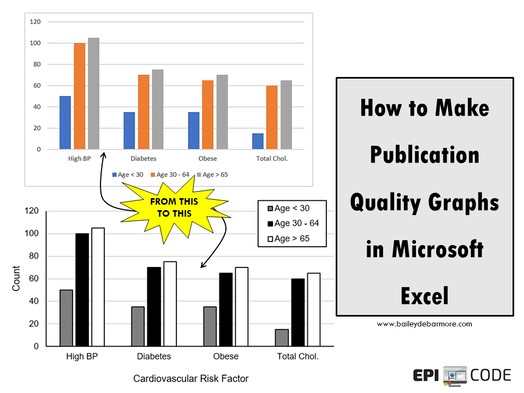
 Learning to clean your data and run the appropriate statistical tests in your program of choice is challenge enough. When it comes to producing graphs for your posters and publications, it can be frustrating to learn how to code to get exactly the graph you want. Using Microsoft Excel to produce graphs can open up a whole new world for you. Easily organizing your data from columns to rows, adjusting categories and axes in real-time can streamline the entire process. While the default figures left much to be desired, this post will summarize several ways to strategically change the aesthetics to create publication quality graphics. summary
Optional
About the Author
0 Comments
Your comment will be posted after it is approved.
Leave a Reply. |

Practical solutions for conducting great epidemiology methods. Transparency in code. Attitude of constant improvement. Appreciate my stuff?

All
March 2021
|


 RSS Feed